Bad vs Good Level Design (02/14/2022)
Bad Level Design:
One bad level design that I
remember was of a game called “Sonic Shuffle.” This is a game similar to Mario
Party, but with different mechanics. The reason why I think is a bad design is
for the way you must play it. Aside from being luck-based, is difficult to
understand the gameplay because you mostly must figure out what’s going on in
the game while playing it.
One example of this is the random messages that show from time to time after an event happen and is not explain to you (it also has a lot of bugs, which can be frustrating).
The battle system to get the gems is frustrating
because you just have a certain number of cards that you must use to defeat the
monsters and to move around the board.
Good Level Design:
A good level design that I remember
is of a game called “Human Fall Flat.” This is a puzzle solving game. Aside
from being a fun game, the mechanics for how to solve the puzzles are well
thought and sometimes challenging.
It can be play with friends or alone and
both ways can be fun and possible. When playing alone, you have to think how to
make things work without the help of someone else (like when you have to
yourself on a platform by pressing a bottom and timing your movements so you
get to the platform on time) or think of a strategy with your friends to solve
a puzzle or so both can pass the same obstacle together (like when one of the
players has to cross a cliff and you have to tell your friend how you did it so
they can do it too).
Simple DnD Map (02/16/2022)

For this assignment, we create a simple DnD map that would serve as a tutorial for those who haven play the game before. It was also played by Kyle Tunison and Joseph Hagerman from class CAGD 270. The duration of the game (by going to some secret areas included) ended up being of 27 minutes. They gave me the following feedback:
What went right?
For this part, they told me that the features of healing/stats boost areas was a nice adding to the gameplay.
 |
Healing area of 1 use only
|
I decided to do 2 different types of healing areas.
One of them is given to you to replenish any loose health and it was 1 use only.
This resting area played a big role for them to be able to continue because one of the character died in a previous battle.
But dying didn't prevent them for continuing. Because they were able to respawn as a different character (by loosing one turn), the manage to continue and advance to the next area.
 |
| Boosting area. Multiple uses. |
But the boosting area was the one that had the most interesting feature. After defeating enemies that were optional (the Trolls and Orc), they received as a reward a healing bonfire, that gave them full health and a minimum attack and shield boost.
What went wrong?
As though the amount of enemies was fine, some of them were a little too strong for just two players. Thanks to this, one of the players died in the second combat. They also suggested that in one part there should be more enemies to prevent the advancement of the players.
 |
| Cool gang too powerful |
Because of the mechanic for this group, you have to attack the priest first to be able to success. But the stats for each one of them were a little too high and, after rolling a 6, they killed with just one hit one of the players and the battle prolong for more minutes than what was first intended.
They are going to be ton down a little bit for the sake of saving time and to prevent the players have a hard time in the future.
 |
| All alone |
Another mistake was to live this enemy alone to prevent the access to the next area. Is was not a strong enemy and, even though it have a poison feature, it couldn't handle one attack and the players weren't able to see what it was capable of doing.To fix this, I decided to add a little bit more of this enemies in this area, that way they could experience the battle against it, without becoming too overwhelming.
How to improve the map?
 |
| No more alone time |
Like I said in the previous part, I will nerf some enemies and put more enemies in other parts. This way the player can still engage in battle, without worrying bout dying and using all the rest of the characters. I hope that with this changes, the players can advance without using all their attempts and be able to finish the map without any worries.
Conclusion
This map was fun to make and see how other people interacted with it. It gave me ideas to improve it and make it more accessible to those who had never played DnD before.
 |
| What does this do? |
Even though it was considered a tutorial map, it didn't felt completely like one. What I mean by this is that, with the descriptions given for each character and enemy, the players were able to figure it out by their own. But the overpower of some enemies felt like it was more like a normal map for those players who are more experimented.
Another thing that I prevented was the looping of one zone.
 |
| Two paths, one stone |
After defeating the first enemies, you are given the choice to go one path or the other, making a possible loop in the process. To prevent this, I used a rock to block the path that was not going to be chosen, but I still give the possibility to explore the other area if they wanted to return. This way, the critical path was obvious and they could concentrate on going forward or exploring a little bit more, making the flow of the game consistent but flexible.The players also figure where to go and how to get there without any explanations. They also were able to success in defeating the main enemy (a.k.a. the final boss) and achieving the propose of the map (a.k.a. saving the elf priest).
Simple DnD Map: Update (02/16/2022)
After the map was updated, played by Kyle Tunison and Joseph Hagerman from class CAGD 270. The duration of the game (by going to some secret areas included) ended up being of 20 minutes. They gave me the following feedback:
What went right?
 |
| United, we are stronger |
They like the features that I had already implemented. Because the enemies where ton down, it was more easy or tutorial like for them to pass them. Some enemies where added in certain areas, to give a little more difficulty to that part, but it was nothing out of their reach. Notes on special actions for part of the enemies where added, so they could have a better understanding on what to do against them.
Because I added more enemies that can put a status condition (poison), I decided to add a feature to the mage that was able to remove any of the status condition when healing their allies or herself.
 |
| Relevant to kill |
 |
| Items droop and discovered |
Another feature that was added and liked was the slimes drooping system. This was added to give the player a reason to kill this type of enemy, but with the chance of not getting anything (if the slime rolls an even number, it droop the item. If an odd number is roll, is not going to droop anything), making it more fun in the prosses. The item that was drooped, is the same one as the rewards that you'll get when you defeat the enemies on an alternative area.
What went wrong and how to improve the map?
 |
| Sad Hydra noises |
Because the mistakes that happen in the previous map were fixed, this time nothing went wrong, except for the boss difficulty. It was too easy and did not gave any type of challenge to the players.
 |
| Happy Hydra noises |
Conclusion
The map was fun to remake, to see how other people interacted with it and if the players got fun out of it. With their comments and advises, I was able to renovate this map, a well as to think in the future of what could be improve.
This time, it was considered more like a tutorial than last time - challenging at times, and easy at some others - with the difficult of the map increasing as they advance. The features to prevent looping where still there and the path was still obvious thanks to that, making the flow of the map easy and without any troubles. They also leaned the mechanics of the enemies thanks to the notes and interactions with them.
Even if their objective wasn't mention, the players were able to figure it out, defeating the main enemy and saving the objective in the process.
Simple Alien DnD Map: Update (02/28/2022)
For this assignment, we create a DnD map with Alien Invasion thematic. It was also played by Kyle Tunison and Joseph Hagerman from class CAGD 270. The duration of the game (by going to some secret areas included) ended up being of 45 minutes. They gave me the following feedback:
What went right?
 |
| His name is Larry |
For what went right, they like the features of the weapons and the Armed Lobster. The ability to use different things to be able to advance
What went wrong?
 |
| The super indestructible crab |
For what went wrong, there were a lot of things this time. The final boss had too much defense and life and it took a lot of time to defeat, extending the game play a lot more than planed. This happened the same with the rest of some of the enemies that were across the map.
This extended the time duration to more than double of the intended and make it even boring at times. Also, you could not make the Armed Lobster to attack.
|
Larry can be an enemy or ally
|
How to improve the map?To improve the map, I decided to make the enemies less strong and make the Armed Lobster a pet tat is able to attack, to add more fun to the gameplay, but having the option to defeat him if the player wants to.
Conclusion
The map felt slow due to the enemies that were introduce and this make it feel boring and a little out of time. The critical path was obvious, but it could be improve in different ways and maybe improve the time progress too. Whit the descriptions given to the players, they were able to figure out what to do and how to approach each enemy and the rules of each object and enemy that was there.
Fortunately, there were no loops on the map, but the walking places felt a little too long, without much events happening.
2D Megaman Level 1 V1 (03/21/2022)
For this assignment, we create a Megaman level for introduction. It was played by Michael Bohmann, Jeffrey Maltz, and Matthew Mills from class CAGD 270. The duration of the game play (the longest one) was around 10 minutes or more. They gave me the following feedback:
What went right?
For what went right, one of the things that they like about the background and blocks is how I separated the up ground to the below ground. It was just an aesthetic aspect, but they though it was good thing to implement.
Another thing mention as a good feature was the punishment that was implemented when falling certain parts of parkour. By falling out on certain parts, you could go all they way to the right and found a dead end with a healing object, or a way to continue with the level.
But it was not a harsh punishment when rewarding at the end with some health orb that would make it more easy in the end.
Another nice feature was the potion to be able to kill the chicken with the falling blocks or by figuring out how to kill it. Because this enemy is a little difficult to figure out how to kill (you have to hit it on the face to be able to kill it), I thought it was a good idea to skip this part with the falling blocks and still be able to kill it and prevent unnecessary damage.
They also though that the level was fun to play and didn't commented if the amount of enemies was too much. Some thing were easy to figure it out once you start playing and the amount of checkpoints wasn't too overwhelming to the fact that it felt too easy, but it was also not too difficult either.
What went wrong and how to improve it?
For what went wrong, they are a few thing that they thought need it more work to put one more check on a certain part of the level, so is not too much what you have to go through.
Another thing that was a little weird to figure it out was what the switch does and they suggested to make it more obvious or to have an example of what it does with certain block and ladders.
In some places, the checkpoint position became frustrating just because of the enemy's placement because if you died and reappear on that checkpoint, you got hit even if you didn't want it to. They suggested to change the enemy's position or checkpoint.
One thing that wasn't mention but I thought of it while seen them play the level, was the porcupines enemies. When they combine together, they became frustrating to deal with. Even if you figure it out, is still difficult to deal with them as a first-time player. One thing that I thought to change, without making it too easy, was to remove one of the porcupines (there are always two together) so is more easy to deal with them.
Conclusion
The map was fun to play for the players. One of the things that they didn't know if it was a good idea or bad idea was the length of the level, some thought that it felt too long and others thought that the length was perfect, and I couldn't decide if it was a good or bad feature for my level.
By seen them play my level and by playing their levels, it gave me ideas on how to improve certain parts of my own level or features that could be implemented that I didn't do at first. It became inspiration with their constructive criticism and just by showing different ways to play it.
Over all, it was a fun level to make. By having a specific time length, it became frustrating at time but in the end it was worth it to see people having fun playing it.
2D Megaman Level 1 V2 (03/28/2022)
For this assignment, we updated our last Megaman level for introduction. It was played by Michael Bohmann, Jeffrey Maltz, and Matthew Mills from class CAGD 270. The duration of the game play (the longest one) was more than 10 minutes. They gave me the following feedback:
What went right?
They had told me before that the level itself was fine. And, because little things changed on this level, most of the feed back stayed the same as last time. And this time, the length of the game was seen as something good.
But, for the things that change, they like the fact that I introduce a check point here and that put some introduction of what the blue blocks can do when the orb is hit.
This was helpful to let the players know of what to do next, plus the gratification of having a healing orb as a reward.
The inclusion and the change of place of more check points was also well like, due to the fact that, if you died, you would be able to keep going, without repeating longer sections of the game, or by been too close to each other.
Some people thought that the placement of the keys was cleaver. The fact that I have more places to go instead of everything been linear was also appreciated too. This added more interest in the player to keep exploring different paths and options that I gave.
The placement of health orbs right before the mini-boss at the end, was also another feature that was liked. This was also due to the fact that the level was extended a little bit more, making it more useful because people may have being low in health before facing the mini-boss. A checkpoint could have being useful here, but I think it works perfectly how it is.
What went wrong and how to improve it?
For what went wrong, there were just two things that people thought could be change in the level. One of them was to put a more obvious part that let you know that you can jump on this part on the last block so you could reach the platform more easily. This was suggested that was possible with a small healing orb.
I think this one could work perfectly as it is, but some help to realize what to do could be appreciated by the player, so I may try to put something there o make it more obvious.
Another thing that was suggested was to remove the keys and door on this section. They said that was unnecessary and could be taken off. One person recommended to change the keys with healing objects and to just put a single key and the door instead, that way it could be more useful to the player. I think I like the idea of putting small healing orbs instead of keys. I have to agree that the keys are useless and the player would be more grateful to have something more useful that could make their gameplay more enjoyable.
Conclusion
The map was really fun to recreate. This time the ideas came more easily, due to the fact that I just needed to change a few things and add some others, so the game was more convenient and fun. I found myself even wandering to make the level longer (which would have being bad), when I had troubles coming with ideas to extend it before.
Even though this game had less things to change, I still have a few things that could be improve to make it better and more fun. I really appreciate the feed back of my classmates as well as my relatives that played the game. They made me realize what I have to improve and what is working fine.
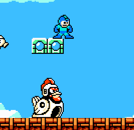
2D Megaman Level 2 (04/04/2022)
For this assignment, we create a Megaman level for introduction. It was played by Michael Bohmann, Jeffrey Maltz, and Matthew Mills from class CAGD 270. The duration of the game play (the longest one) was around 13 or less. They gave me the following feedback:
For what went right, they told me that the level was a good one. They said that the difficulty was fine and that they like how I presented the new power ups and how to use them.
Some people outside my classmates play also this level and thought that this part was one of the most fun to play.
Over all, they thought that the game was fun to play, that it wasn't too difficult or too easy, perfect for those who are starting to play Megaman.
This even game me ideas in new features that I could implement during the game to make it more fun and challenging, without making it frustrating.
What went wrong and how to improve it?
For what went wrong. There were a few thing that could be improve, one of them being the fact that I put too much checkpoints and that made the level too easy.
To solve this, I decided to remove some of the checkpoints on parts that I think could be easy to solve or not too dangerous for the player (like in the part showed in the image in the right).
There was also another problem with the transition from one point to another and that could make the whole experience a little more fun. Although this is more a problem on how Megaman Maker is design, I could have try to solve it by my level design too. Maybe by changing some scenes and make them more long or shorter to fit the criteria of the software.
Another thing that was suggested was to put more health after certain sections. This could help people to continue without dying because they were low on health due to the fact that they face enemies that do too much damage.
Another thing mention was that the placement of the enemies could be a little problematic. One example of this was the Metal Cannon towards the end of the game. Is in an awkward position and may be not so functional when shooting. This could be a problem for the player to kill it, or for the Metal Cannon to kill the player.
Another problem found while playing was the placement of this ladybug towards the end. Because this enemy gets activate when it sees the player, they go directly to attack Megaman and do not leave him alone until you kill them or they kill you. This became a problem because it didn't let the player figure out what to do in this part, and became frustrated because they weren't able to do anything because of the time reaction given to them. One thing that could solve this problem is to just get rid of this specific ladybug so the player could have enough time to figure things out and have a moment to relax fore the next section.
Another thing that were suggested where to implement more parts that uses water because it was introduce in the first section of the game. This could be exploited to my benefit so the player could access to certain areas (this is do to the fact that the water let you jump a little bit higher). Other thing was to remove the Kick power in certain parts, to be more dynamic (like I did with the Arrow power).
Conclusion
The map was really fun to recreate. It was more challenging to think of a way to make the level more difficult, without making it too frustrating. I was able to see the mistakes that overlook while making the level when I saw my class mates and other people play it.
This time I didn't thought it was difficult to come with ideas on how to extend the gameplay, but my annotated map was still short in length.
Overall, this was a fun project to make and I really like to experiment with new powers and a new environment.
3D Level 1 V1 (03/18/2022)
For this assignment, we create a 3D level with GameKitLite for beginners. It was played by Michael Bohmann, Kyle Tunison, and Matthew Mills from class CAGD 270. The duration of the gameplay was around 7 to 10 minutes. They gave me the next feedback:
For what went right, they told me that the level was the use of the Polybrush to create different levels in the ground. Some of them didn't know about this feature and thought that was a cool feature added.
They also told me that the difficulty was perfect as a beginner level, which was the main objective.
Although this was mentioned as a good feature, I think it could have improvement in many ways to make it look more cool or proper.
Another feature that was mentioned as a good thing was the big orb at the end of the level. They thought it was a cool thing to have at the end and make a sense of accomplishment.
This was my favorite part of all the level and was the easiest to make and think about. I was glad that someone like this feature too. But still, I think this could be improve by adding something else that could make the player know that they finished the level.
What went wrong and how to improve it?
For what went wrong. There were a few things that could be improve, one of them being the spelling. I misspell a few things and I could have prevented that. For how to improve this, I just have to make sure that everything is spell right and to double check just in case.
Another thing that cause problem was the water. Because I didn't mention that water is dangerous, people thought it was fine to swim on it, which it was not. For how to improve this, I was told that maybe just by adding a dialogue mentioning the danger of water was fine.
The last thing that I was told could improve was this platform. Because of how it works, this could be problematic for long distances because players could easily miss the platform or the next part of the ground. A way to improve this was to add a new platform or change the platform for other thing that could be use here.
Conclusion
This level was fun to think on how to make but was a little bit frustrating on making. With MegamanMaker it was easy to figure it out, but with this one was a little bit more difficult to think on what to add and how to make it work. Although I had the tutorials, there were a few things that I would like to implement but didn't have at my disposition or didn't know how to make.
Even if I had use Unity before, as a beginner on this software, was a challenge to move things around and make things work properly. Also, to think in how to add a new asset like a final boss without too much knowledge in coding or modeling, is almost impossible for me to figure it out.
Even with that being the case, I still got fun making the level, even if I wasn't satisfied with how it turn out. After seen my teammates levels, it gave me ideas on how to improve mine visually and structurally, as well as what I could add to make it more interesting for the player because I thought it was fun on their levels.
In the end, this project made me realize that making levels is not as easy as it seems at first. I would like to explore more this gamekit in the future and try to discover new things that could make it more easy for me to use. I also would like to see if I could find features that were not mentioned on the tutorials to make it work as I intended to at first.
Overall, I think it was a really interesting project and would like to keep using it for the time come to explore more of it.
3D Level 1 V2 (03/25/2022)
For this assignment, we re-design our last 3D level made with GameKitLite for beginners. It was played by Michael Bohmann, Kyle Tunison, Carlos Hernández, and Shane Jensen from class CAGD 270. The duration of the gameplay was around 7 to 10 minutes. They gave me the next feedback:
Like in the previous version, they said that the difficulty of the level was fine. I wasn't too difficult or too easy for them.
As for the design of the level itself, I still struggle with how the level look and wasn't able to change it because of the texture added to the ground that it meant to have. I was not able to use the Polybrush with new planes and ended up using the same design and nothing much change.
Another thing that was mentioned as a good thing was the change to the moving platforms that was made on the long platform section.
Instead of having a moving platform, I decided to change it for rising platforms that were activated by stepping plates. And, instead of just one, I put two of these plates to make it a little more long and more fun to play.
Also, they say that they are coming out of the water was a cool feature too.
Although this was mentioned as a good thing, they told me that it can be confusing as it is, so adding a dialog tag could be helpful because one of them stay looking at one of the walls, expecting something to happen until he saw the platforms.
What went wrong and how to improve it?
For what went wrong. There were a few things that could be improve because it was not intended to be like that. One of them was the switches in the high platform close to the end. If the player were to fall without activating that switch, it could be a problem for them because there would be a form to get back up. To improve this, I was advised to add some platforms to go back up or to add a checkpoint so the player could respawn there.
Another thing that was mentioned, and was not the intention of it, was how the player was able to walk on a little section with ground on at the end of the level. This was not supposed to be like this, but some of them try this and were able to cross this section without going on the platforms that were place so they could cross this section. To improve this, I thought to make the wall thicker to cover this section, so the players were forced to cross this section through the platforms. Although it was not the intention for this part, I thought it was funny to see how some people trail of though goes to discover this type of mistakes.
And for the last thing mentioned was the big section of water that was not used. This section was not intended to have anything, but seen it there was kind of a downgrade for the level design itself. Big parts without nothing there makes the level feel empty. For how to improve this, I thought to additional gameplay that was not necessary for the player to complete the level but could be fun for the player to play; like a secret area to get more health or to get a reward or collectable.
Conclusion
This level was a little bit frustrating and fun to re-design. Because of the limitation of the plane itself, I wasn't able to change much about the structure of the level, which became frustrating for me because I wanted to change it more. But it was fun to think in new features to add to this level to make it more fun or easy to conclude.
By seen someone's level that was completely different than mine, I thought of ideas that could be added and that could improve the appearance of the level farther. I may try to re-design the level from scratch in the future and see if it would have been better or worst.
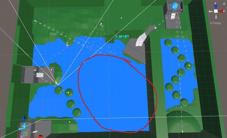
3D Level 2 V1 (05/04/2022)
For this assignment, we design a 3D level hard made with GameKitLite. It was played by Bryan Ramirez, Jeff Maltz, Andrew Hovsepian, Carlos Hernández, and Joseph Hagerman from class CAGD 270. The duration of the gameplay was around 7 to 10 minutes. They gave me the next feedback:
What went right?
For what went right, they like the idea of the separate ways. I gave the player the option to choose between two ways to pass the level. Both paths were very different in how to accomplish them, but with the same point to end it.
The design for this level I wanted to give the option to the player to choose if they wanted to play a level with more enemies, or a level with more parkour. I tried to give the player the freedom to decide where to go.
Another aspect of the game that people liked was the fact that the switches were hide in destructible boxes. This gave them the opportunity to explore the level a little more and have the chance to discover new things hide in those boxes. This was one of the features that I wanted to implement the most because I thought it could be a good experience for the player to be able to look for the switches to add more gameplay.
One thing that they also liked was the design of the game itself. Although I think this could have improve this a lot more by seen my classmates' levels. But I do not have the knowledge to be able to make the aspect of my level to look better.
What went wrong and how to improve it?
For what went wrong, there wasn't much that they thought it was not working right or that should be change. But one thing that they told me could be improve was to make it more obvious when the level is finished and bottleneck to prevent the players going back to the begging of the level so the players wouldn't get confused or to go to the rest of other path given.
One of the recommendations that I was given that I could use a door that could have the same color as the walls to cover the doors that lead to the other path. This could be achieved by making a new door, which would be the same color as the walls, would rise when the door to get to the end was opened, preventing players confusion on how to open those doors.
Another recommendation given was to close the door when crossed on the begging of the level. This could be achieved by having a plate being press when crossing certain part of the hallway crossed, this would rise the door again to end up closing behind the players.
Conclusion
This level was a lot more easy to design after having the experience of my first level. The ideas on how to design the level also were more easily to design or to come with ideas of what to put in each part of the level. I was able to make the structure of the level how I wanted, in most part, and I was able to implement the amount of enemies that I wanted to add. I also was happy to being able to implement the two paths that I wanted to add for this level.
Overall, I liked this experience way more than the last level. It was less infuriating to design than last level. Because of the knowledge that I had now about this game-kit, it was more easy for me to come with ideas on how to use the different materials given in the kit.


No comments:
Post a Comment
Note: Only a member of this blog may post a comment.